


More
Cases

How do you onboard thousands of free trial customers each month? Hotjar is a freemium product analytics product that can be complex to start with, and not all customers and their intent are the same. My work for Hotjar involved a customer experience design initiative. There were parties involved from sales to customer success, the data team, and two product teams. We've shipped holistic experiences delivering white-glove service for high-value customers and bringing new users to value faster.

Calliper wanted to build a quantitative goal-setting and tracking experience as a retention feature that empowers customers during company all-hands meetings. I've designed the product experience from 0 to 1. My process included speaking with customers, benchmarking with the market to inform the architecture, and delivering the feature through to the final UI.
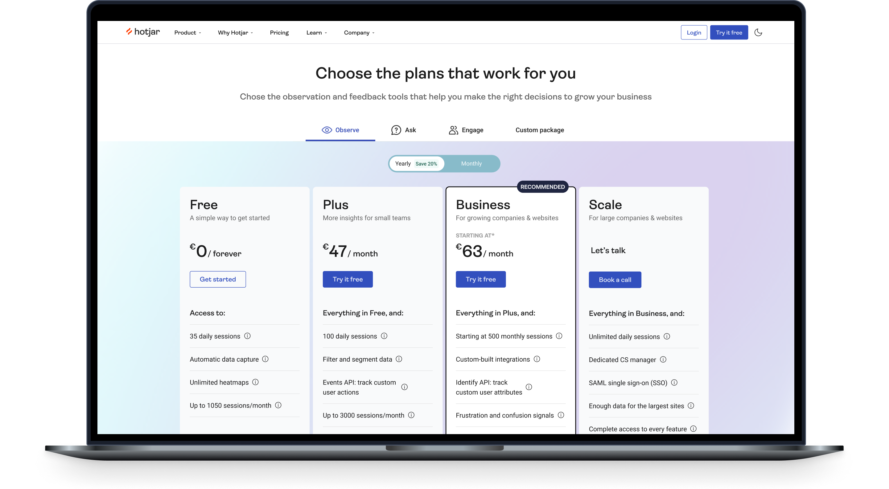
One of the projects I worked on at Hotjar was to simplify the design of their new pricing. Hotjar's latest offering was a platform that included two more products on top of the original single-product offering. I run the project from data analysis to customer interviews to wireframing new experiences to the final UI of a new pricing page and the implementation.

Previously, Roger, CorpayOne was an accounting automation platform. In short, they help you pay vendors & automate bookkeeping workflows. Naturally, this SaaS product is quite complex to set up. As part of an OKR focused on improving the product's usability, the KR I led focused on enhancing the customer's first experiences with the product, from website visits to subscriptions - leading the customer to the value.

How do you incubate innovation in a corporate? As a part of WoodWing's startup Swivle, I've performed customer research to understand the needs of different SMBs with millions of marketing or sales assets, built an acquisition engine, and doubled the MRR of this startup in 1 year.

Piktochart helps non-designers communicate visually. The majority of Piktochart's user base was coming in organically, and they capitalized massively on demand for infographics back in 2015. The product had great acquisition metrics but suffered from low sign-up and subscription rates, and customers were either not subscribing or were not sticking around. The project I worked on targeted acquiring 200,000 sign-ups monthly.